Final Project Phase 1

    1. How can we make electronic devices that can be reused past it’s initial purpose?
    2. I want to explore the life of technology past when people are done using it. I will be using speculative design to try and find a way to reduce the waste technology produces.
    3. My plan for the first two weeks is do a lot of research and reviewing the essays my project relates to. After the first week or after I think I’ve gathered enough research I would like to start sketching a lot of designs.
    4. To document my work I will be getting track of all of the sources I’ve been researching and highlighting what I found interesting about each article. As for my sketches I will be sure to add descriptions so when the next person gets my work they have a detailed knowledge of what each sketch is.


Course Probes

My three probes included:

  1. A compass to mark where in the U.S. they were born.
  2. A piece of string with one knot in it that my user had to tie knots in marking if a sibling was older or younger and how close they are to the user.
  3. A blank space for them to draw their childhood animals.

The responses I got for #1 was that she born in the North part of the United States. For #2 my user tied three knots all of them are very close to each other and two are on the younger side, the other one is on the older side. The response for #3 is a drawing of a dog.

img_6160.jpg

My design went off the string that I had my user tie knots into, I thought it was the most interesting result of my probe, so I wanted to create something around that. Basically my design is just using the string as a bracelet. When you squeeze the knot that is associated with a specific sibling it sends them a notification that you are thinking of them. I think it’s a really cool idea because sometimes you are busy and just forget to reach out to your family regularly. Now all you have to do is squeeze a knot to let them know you miss them or you’re just thinking about them.

img_6161.jpg

The responses to my probes were what I expected, probably because my probes were specific in what I was looking for. My favorite and most revealing probe was definitely the probe where I had my user tie knots in a string to represent the age and closeness of their siblings. Sometimes when you are talking to someone you ask them how many siblings you have and if they are older or younger you don’t know how close they are. I also think tying knots in a string is good visual representation of her family because it’s four very close knots. Just by looking at this probe I know she has a pretty big family and they are all close.

Material Studies

My material is aluminum foil. I did a lot of experiments including folding it, unfolding it, holding a lighter to it, and trying to restore it to it’s initial form. In all of my observations of aluminum foil the one that stood out to me was the fact that it made noise when you touched it. I thought this would be an interesting path to take because when people use aluminum foil it usually isn’t to make noise. My invention is a new percussion instrument that can be plugged into to a laptop to create new music! One of my favorite parts of the reading was when the talked about materials being like a riddle. I feel like making music sort of like a riddle too, you need to figure out what beat goes with the song. There are so many different ways to make noise using tin foil you could probably make a whole song using it. The life of aluminum foil is interesting. It is very malleable, so you can shape it into a lot of different things; however, I could never get it back to its original smoothness.

Perception Studies

IMG_6138IMG_6131


IMG_6133

The goal of my walking algorithm was to mimic what I imagine programming a robot to walk would be like. I tried to use a lot code language like if and while statements. My code includes some of the main obstacles you would come across walking through campus. Something I noticed while following someone else’s directions was things I would normally do without even thinking about I couldn’t perform because it wasn’t in the algorithm. For example, I was outside and I was right in the middle of a sidewalk when I heard a skateboarder coming. Typically I would just move over towards the side, but the algorithm didn’t say anything about skateboards. I ended up just breaking the rules because there were people walking and I didn’t want anyone to get run in to.

For my design I created a device that will charge your phone if you walk a lot. The more you walk, the more charge is available. My design amplifies the fact that people would be willing to walk around to allow them to charge their phone. It also amplifies the fact that we use our phones so much we can’t make it a whole day without having to charge our phones. I envision that this design could be used for someone working an office job and their phone is dying. They also are trying to lose weight, so they can kill two birds with one stone by going on a walk to allow them to become more active while charging their phone. Now this person enjoys more walks and in places they normally wouldn’t walk around. They are now seeing new sights and their walk is for a purpose, which might inspire them to walk more.

Future Product Catalog

My catalog is called CB2 x Fred Segel,Ā it’s a catalog full of modern home good items. I chose to focus on the various lamps they were advertising. When I typed in future of lamps it came up of with various new ways to design lamps and also a few articles on how the future of lighting is with using lasers. Lasers are more environmentally friendly because you could use one laser to light up an entire room instead of numerous light bulbs that can burn out easily.

IMG_6115

IMG_6116IMG_6117

I chose to take a utopian, eco-friendly route in creating my future catalog. The rocking chair can produce power as you rock it, so I added an outlet to the side of the chair. Then I plugged my heating rug into the rocking chair, so if you are using the rocking chair you can heat the room while being green. You can also plug chargers in to the chair, it’s not just limited to the rug. I also included a little bit of the laser lights I did my research on to tie into the eco-friendly theme I was going with for my catalog. Some of the issues I saw for future of house products is that everything might become connected. This can definitely be good thing and make life easier. On the other hand, like in my design if you want to heat the room you need to use the rocking chair and if you don’t want to sit in a rocking chair to produce power then your room is going to be cold. If I had more time I would have gone way more in depth with this design. Everything in the room would be connected, making power for each other or every product would be very environmentally friendly. Maybe I could include a table that has a solar panel on top of it so it can charge up energy from the sun during the day and that power can be used to turn on the lights at night. One of the comments I received from the sticky notes was maybe I could also make the rug have a cooling feature, so you could still use it in the summer to cool the house.

img_6118.jpg

Subversion Exercise

  1. instagram
  2. facebook
  3. google(maps, gmail, calendar)
  4. bandsintown
  5. snapchat

The design on the left is called Bread Crumbs it blocks cookies and allows you to turn on a VPN if you have one so the sites you visit won’t track your activity. The design on the left is called Cookie Monster and it is completely opposite. It replaces the ads you get on sites with coupons for websites that you have visited. Also, if you you are about to purchase an item it can tell you to hold off for a few days because a sale is near.

I would say the design that does a better job at creating space for contestation is the Cookie Monster design. It completely embraces the cookies, which a lot of people don’t like and turns it into a more positive thing. The reason it does a better job is because as I mentioned before people don’t really like that their computer can track their activity. People would probably either love it or hate it. On one side it gives you great deals and can save you money. On the other side it invades your privacy by tracking which sites you are visiting and buying from.

This design for sure provokes contestation toward surveillance because it uses surveillance against itself. The sites that keep cookies are now being tracked by Cookie Monster to find the best deals and save people money. It may have companies think twice about using cookies because now we are reversing the roles and taking surveillance on them to find the best deals for people getting cookied.

Misuse Studies

IMG_6077

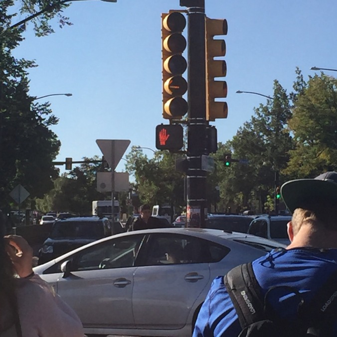
I captured a picture of the crosswalk light and it falls under democratic and authoritarian. I believe it to fall under both categories because it is trying to control when people walk, if the hand is up, you can’t walk and when the walking man is up, you can walk making it authoritarian. On the other side, there’s nothing stopping you from being able to walk when the hand is up, people still cross the street even when it says you can’t, making it democratic. My assumptions is that the walk light was designed for it to be authoritarian, because it’s goal is to control the flow of pedestrians and keep them safe from being hit by cars. The social norm makes it democratic because everyone just crosses when there are no cars, even if the hand is up. It would actually be weird to me if I saw someone waiting to cross at night when there were like no cars out.

IMG_6080

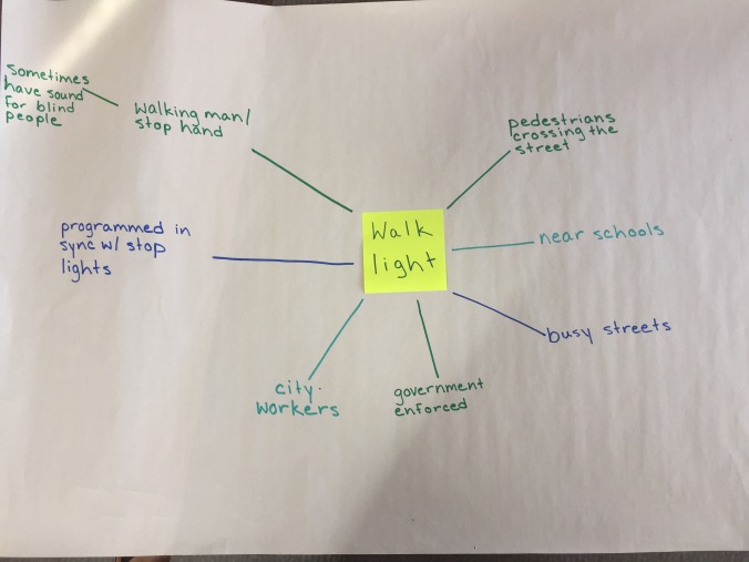
Here’s my sociotechnical map, I highlight how you find walk lights mostly near schools or on busy streets. I also wrote down how it is programmed to be in sync with the stop light and also how some walk lights use sound for people who are blind.

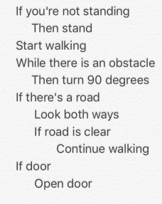
For my design sketch I created platforms that are placed on the sidewalk right before you reach the street and if you step on one while the hand is up, then you get lightly zapped. The zap isn’t painful just uncomfortable and it won’t hurt children. This design makes the walk sign more authoritative, people will have a much more difficult time disobeying it. It also calls to attention how easy it was before to just walk across the street even though you’re technically not supposed to.

Inverting Metaphors

FullSizeR

https://www.wired.com/story/google-emoji-redesign/

The original goal of Google’s new emojis is to make the emojis compatible across android and apple products. My inverted goal was to then make emojis as incompatible as possible to the point that when you send an emoji from an android to an iPhone the only thing that would appear was a complicated code involving numbers and letters. The only way to figure out what those numbers an letters mean is to buy my amazingĀ The Book of Emojis where you can look up your code and see what emoji was sent.

My design assumes that people are desperate enough to want to buy an Emoji book just to translate what they are receiving over text. Communication is an important part of life and Emojis have become such a huge part of that this book might actually be worth the purchase. I could definitely see a high school or middle school student (generation Z) wanting to purchase this because Emojis have almost always been a part of texting for them. If this design were to be executed it would definitely make communication more complicated and time intensive, which is completely opposite of what emojis and text messages were made for. Technology affects our daily lives, if something were to change even as minor as emoji compatibility it could complicate how we operate from day to day. Sometimes I send texts with just emojis and no words, the android user would either have to buy my book to figure out what I was saying or have to ask me what I said, which takes more time than just being able to see the emoji. I would say this design follows none of Senger’s design principles, it’s complicating something that already exists and is completely ruining the user the experience. Reflective design is completely based around the user, this emoji book goes the complete opposite way and designs for the company to make more money.